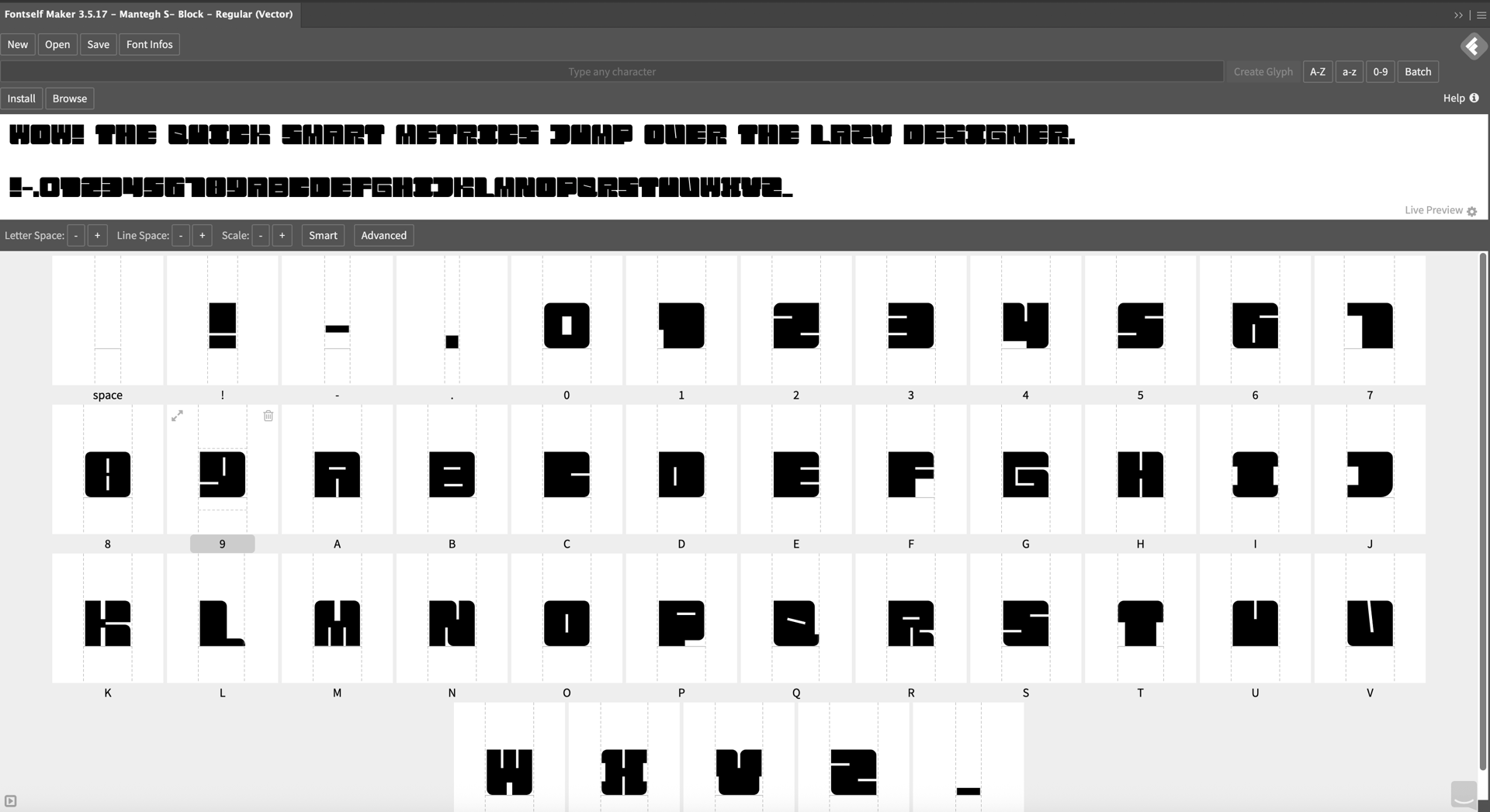
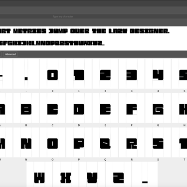
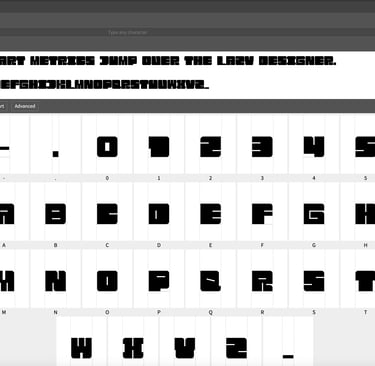
What Goes Into Designing a Commercial Display Font for Brands . Mantegh ST – Block Font design
Designing a Commercial Display Font for Branding Impact. Focusing on Font Design is the best tool to unify any brand.


Designing a Commercial Display Typeface for Branding and Products
In brand design, typography is often treated as a final decision. In reality, it should be one of the earliest. Typeface design is not about aesthetics alone—it is about strategy, usage, and long-term consistency.
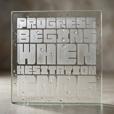
Mantegh ST – Block was developed as a design exercise and commercial case study to explore how a display typeface can be shaped by branding needs, physical products, and real-world applications.
This project reflects how we approach custom type design at Mantegh Studio.
Starting With Purpose, Not Style
Before any letterform was drawn, the focus was on use cases:
Where will this typeface live?
Will it be printed on fabric, packaging, or signage?
Does it need to stack, repeat, and scale?
Should it feel expressive or controlled?
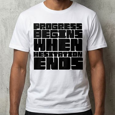
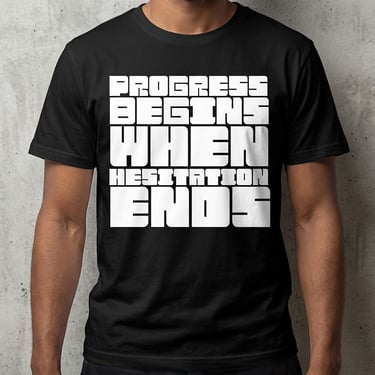
Mantegh ST – Block was defined early as a commercial display font—not decorative, not experimental for its own sake, but designed to perform in branding, merchandise, posters, and packaging.
Building a Typographic System
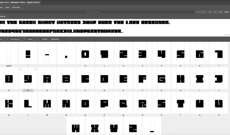
Rather than designing individual letters in isolation, the typeface was constructed as a system.
Key considerations included:
A modular grid to control proportions and consistency
Balanced weight distribution to avoid visual overload
Deliberate counters to maintain rhythm in dense layouts
Spacing logic designed for stacked and compact compositions
This system-based approach allows the typeface to behave predictably across different formats and surfaces.
Designing for Physical Products
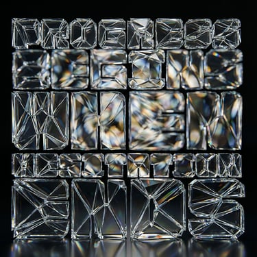
One of the core goals of this project was to ensure the typeface works beyond digital previews.
Mantegh ST – Block was tested and refined with physical applications in mind:
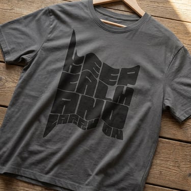
Apparel prints
Merchandise
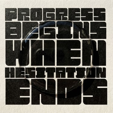
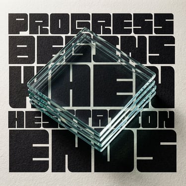
Posters and large-format layouts
Packaging fronts and labels
Designing for products requires different decisions than designing for screens. Letter density, ink behavior, material texture, and viewing distance all influence the final form.
Why Display Typography Requires Intentional Design
Display fonts often prioritize impact, but impact without structure rarely lasts. This project explores how discipline and clarity can coexist with bold visual presence.
Mantegh ST – Block demonstrates how:
Strong silhouettes improve brand recognition
Consistent construction supports scalability
Typography can act as the main visual language of a brand
What This Project Represents
Mantegh ST – Block is not presented as a universal solution.
It is presented as an example.
An example of:
How typography can be designed around brand needs
How display fonts can support commercial products
How type design fits within a broader branding process
At Mantegh Studio, typefaces are designed to match the personality, context, and objectives of each brand, not the other way around.
Closing Thought
Good typography is rarely loud by accident.
It is deliberate, structured, and purposeful.
Mantegh ST – Block represents one approach to commercial display typography—designed as part of a broader exploration into how brands communicate through letterforms.
Designed by Mantegh Studio.
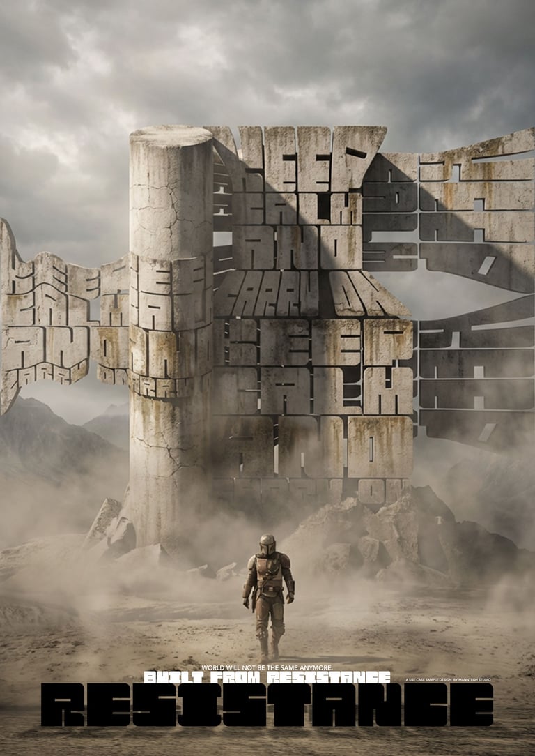
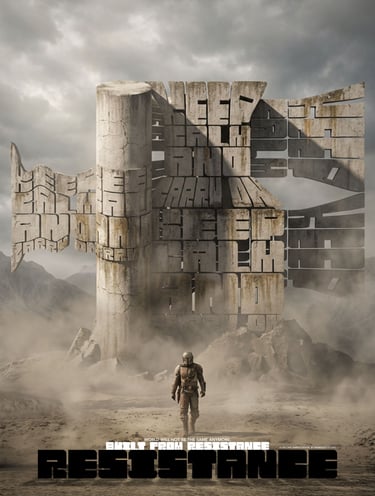
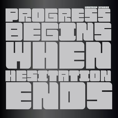
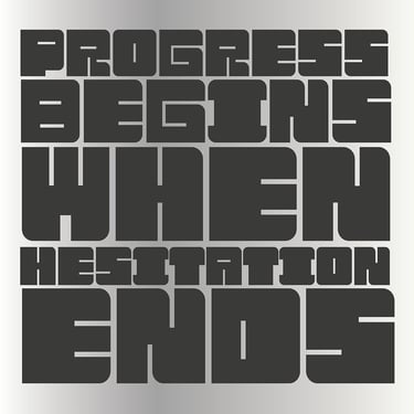
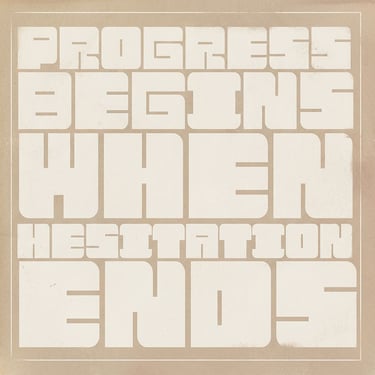
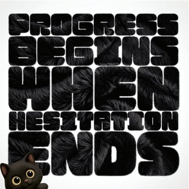
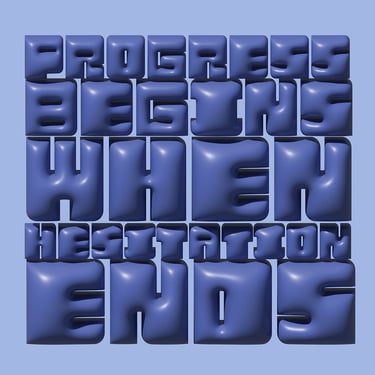
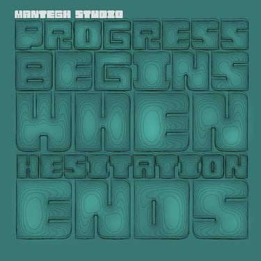
Sample use case for the Mantegh -ST Block font
Specialists
Enhancing your brand with tailored marketing solutions.
Connect
info@manteghstudio.com
+1(647) 707-3242
Design by: Mantegh Studio Inc.
All rights reserved © 2026
What We do ?
Branding
Brand Positioning
Art Direction
Naming
Content Creation
Mural Design
Print Management
© 2026 Mantegh Studio. All illustrations, character designs, artwork, and visual content are protected by copyright and may not be reproduced, modified, distributed, used for AI training, or used commercially without written permission.